BARNARDO'S
STYLE REFRESH
Document styling for the children’s charity, conveying sometimes-sensitive content with engaging colours and illustrations.
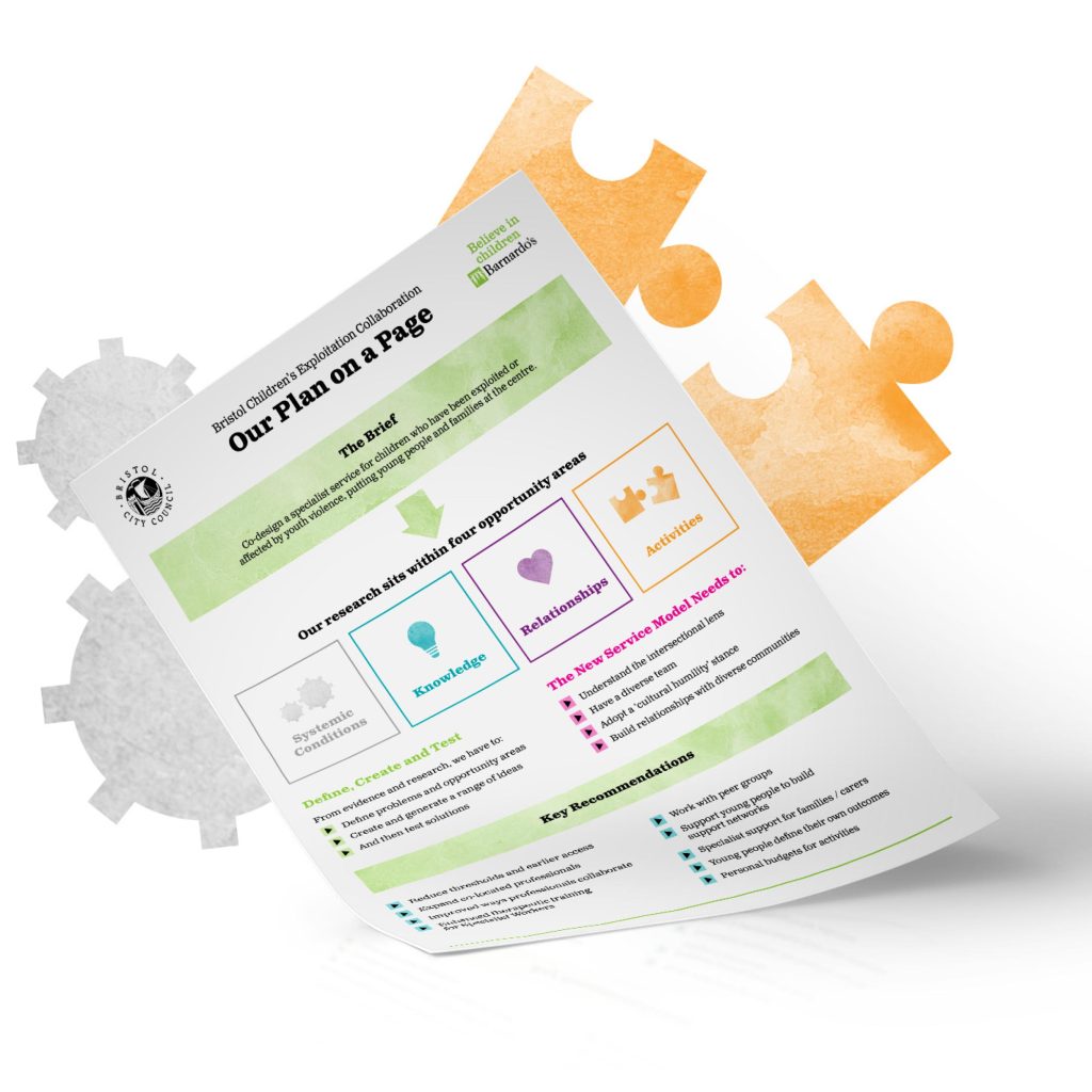
Barnardo’s are a charity who protect, support and nurture the UK’s most vulnerable children and aim to create a world in which no child is turned away from the help they need. We were approached to develop a new style which could be applied across all Barnardo’s assets within the Bristol region to form a complete set with continuity and longevity.
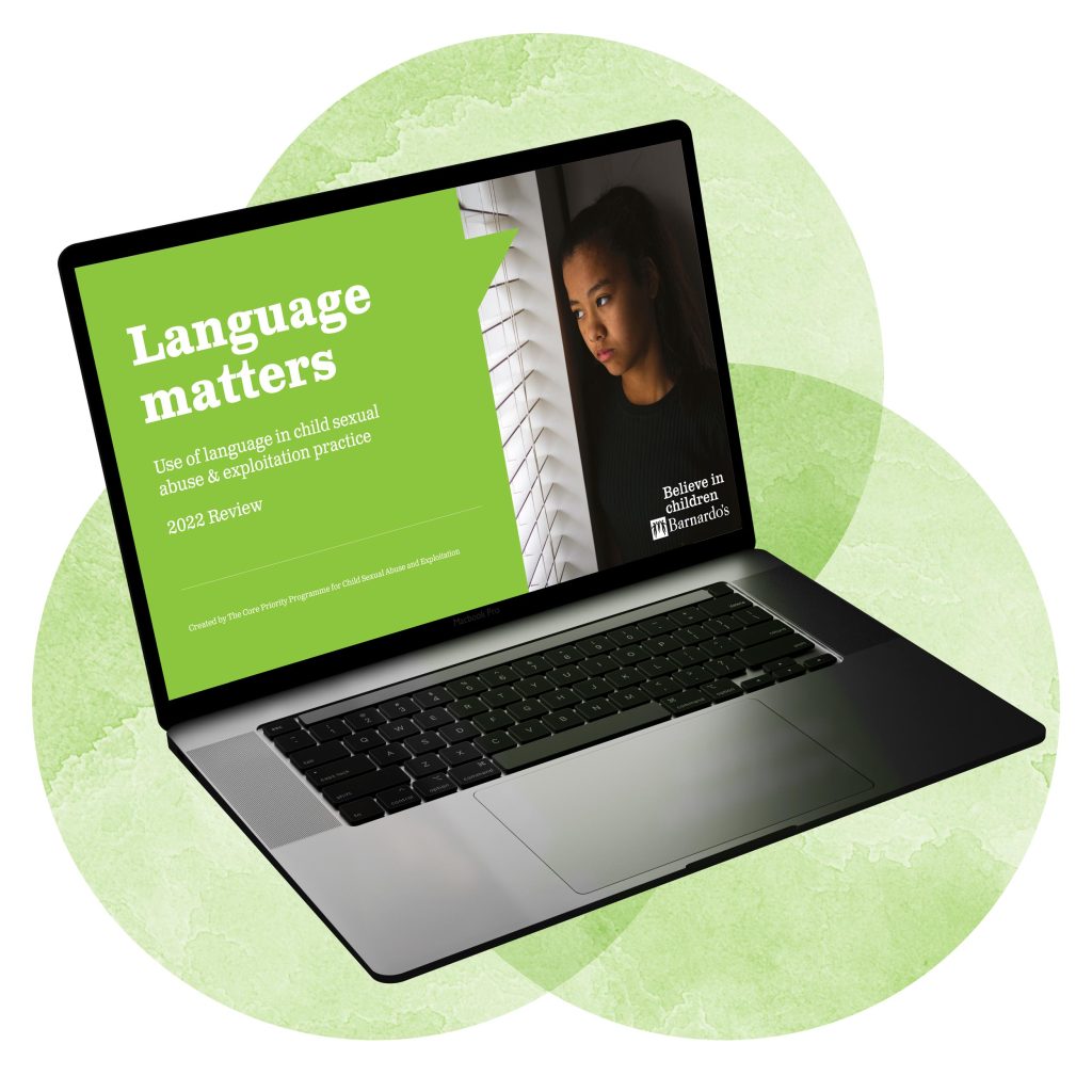
The style we created uses a mixture of soft and bright colours, icons, and character illustrations which help to keep the reader engaged. It was important that for documents where the subject matter is significantly more sensitive, the design can be altered and the bright colours can be replaced with more muted and subtle tones.

BETHAN KELLY
National Programme Development Manager (CSA & Exploitation)
“When looking for a Team to help us bring to life, the thoughts wishes and feelings of children, young people and their families accessing Barnardo’s Services in Bristol, we wanted a team with localised knowledge but also a team who would be able to sensitively create within a challenging and complex landscape.
Dirty Design really came alongside us in the journey of our project and were able to work flexibly and at pace, creating products that truly captured the essence of a work whilst also making it digestible and memorable to a wide audience of stakeholders and organisations.”