NEBULA
WEBSITE DESIGN
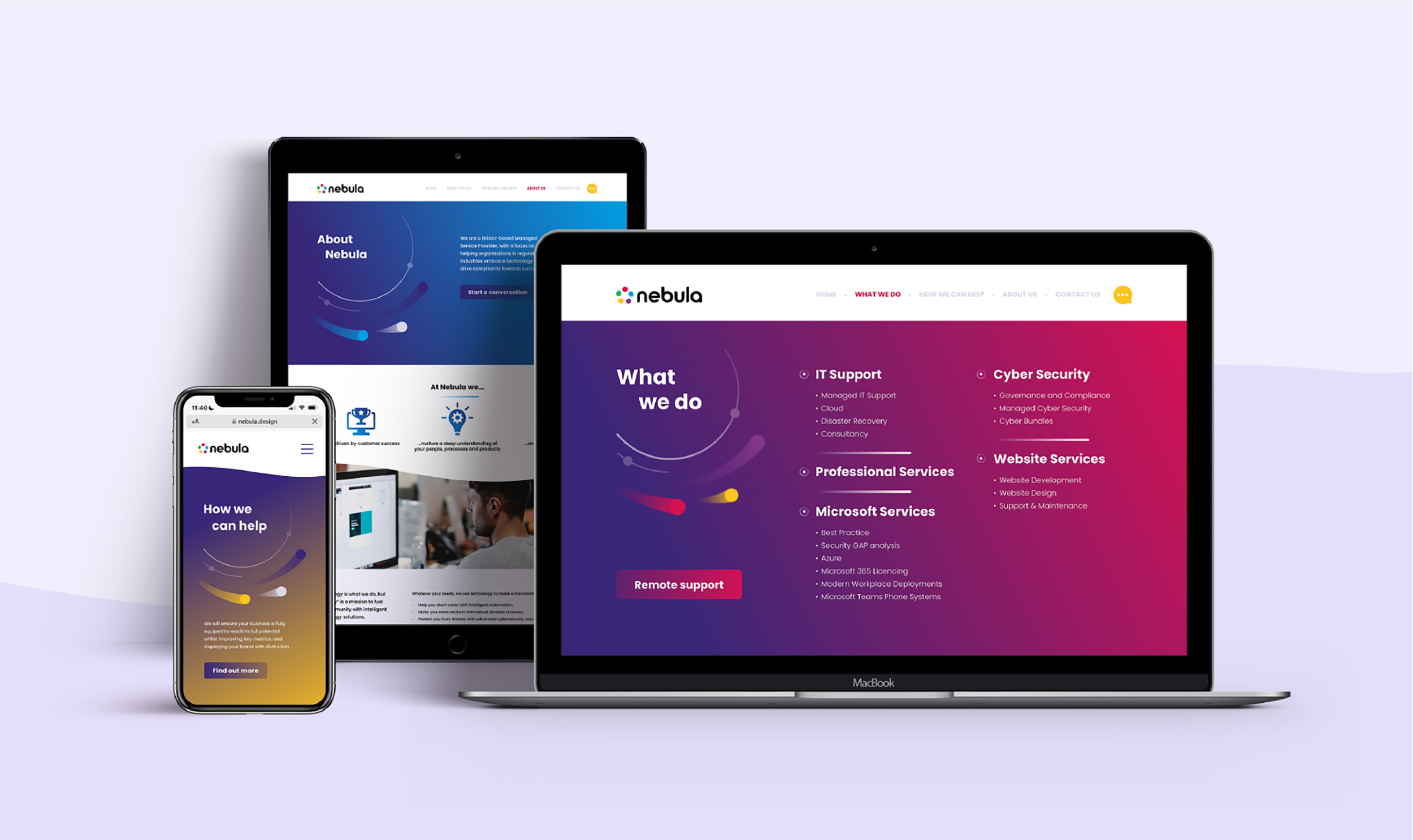
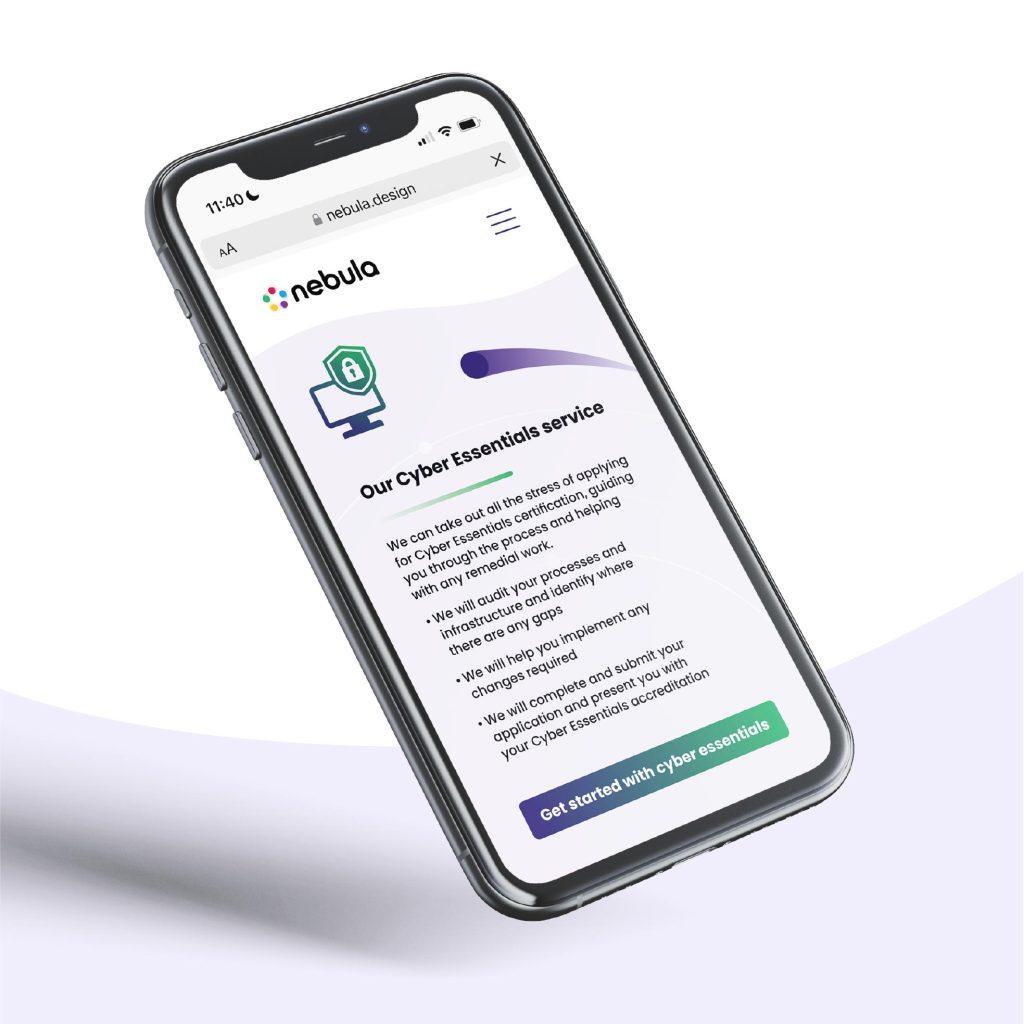
Refresh of the Nebula website, creating a more modern and digestible display of information.
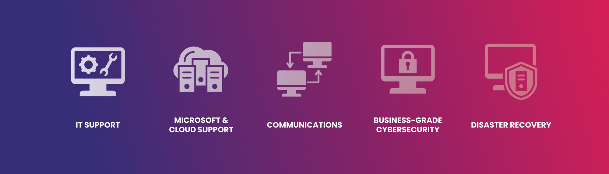
Nebula, an IT company who work with businesses to provide a complete IT solution, wanted a website refresh to create a more attractive and user-friendly website. They needed an effective way to present a lot of content, which ensures that users have ‘room to breathe’ and can easily navigate their way around. The ultimate goal of the website is to relay information and provide quick contact/booking options.
Our concept reimagined Nebula’s current website, providing it with ample white space and lighter backgrounds, which not only enhances its modernity but also facilitates a more digestible presentation of information. The incorporation of circular elements and gradients, executed in a playful manner, harmoniously aligns with their brand identity with a contemporary touch.

DAVID POTTRELL
Head of Digital, Nebula
"Highly recommended! We approached Dirty Design for our website refresh project and were confident from the start that they could deliver. They went far beyond anything we could have imagined and provided us with a design that represents our brand and something we’re ridiculously proud of."